It’s a common claim that each year’s new iPhones are much the same as the previous models, and there’s of course some degree of truth to this.
Bloomberg’s Mark Gurman went as far as arguing in his latest newsletter that Apple’s pace of development with iPhones is such that we only see something truly new every five years …
lockquote class=”wp-block-quote is-layout-flow wp-block-quote-is-layout-flow”>
Apple now appears to be working on a half-decade-long cycle. For better or for worse, the iPhone 16 has a nearly identical look and feel as the iPhone 12. Apple has added a lot other features between 2020 and 2024, but it’s undeniable that the days of frequent hardware changes are over.
lockquote>
I wouldn’t personally go that far. Sure, iPhone visual design is relatively static, but that’s inevitable. Once you get as close as Apple has to an all-screen design, the latest iPhone is of course going to look much the same as it did the previous year. That’s true of any premium smartphone, not just iPhone.
But as Steve Jobs famously said, design isn’t just how a product looks, it’s also how a product works. And based on my first impressions of using the iPhone 16 Pro Max, I’d say that how the camera works this year is very significantly different to last year’s model.
Much is indistinguishable
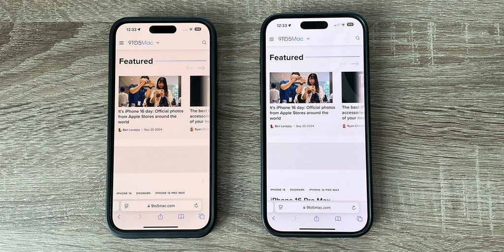
So sure, even when I put the iPhone 15 Pro Max and iPhone 16 Pro Max side-by-side, then the difference between the visual appearance of the two is absolutely negligible.
The tiny screen size difference is visible but hardly significant. The thinner bezels on the latest model, likewise.
Even the handful of comparison photos I’ve taken so far don’t look any different on first glance, though I’ll be taking some tripod-mounted shots for a better comparison in my next piece.
(You can see an apparent TrueTone difference in the two displays, despite the fact that the setting is enabled on both, but this is way more visible in the photo than it is in real life.)
But the Camera Control button means that how the phone works when taking photos is very different.
The Camera Control button
Those who got hands-on sessions at the launch said that the Camera Control button takes some getting used to, and that is absolutely the case.
In particular, I initially found it very hard to judge the pressure difference needed between a half-press (to bring up the notch-style UI) and a full press (to take a photo). Similarly, the double-press needed to change mode was rather finicky. The result was that I would fairly often accidentally take a photo.
Improving the operation of the button
I used the accessibility settings to make two changes. First, I set the light-press force to lighter, so that the difference between that and a full-press is greater. Second, I set the double-press to slower:
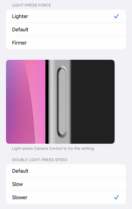
These changes completely solved the problem for me.
But the UI still requires familiarization time
All the same, getting used to the UI does take time. A light-press initially brings up whichever setting you last changed. For example, if it was exposure compensation, then that’s the control you’ll see initially:

To change to something else, you need to do a light double-press to return to the menu of settings; swipe to the one you want; light-press to enter those settings; and finally swipe to the setting you want.
If that sounds fiddly, it certainly is at first – but it’s easier to do than describe, and I’m already starting to get used to it. My guess is that it’ll become second-nature before too long (hey, if my fingers can learn the Sony camera UI, they can learn anything!).
Using it for zoom
For zoom, you have two options. You can select the Zoom icon and then have free reign to slide left or right to your desired framing – or you can select the Camera icon to slide between 0.5x, 1x, 2x, and 5x lenses.
Personally, I prefer to stick to optical zoom where possible (even if the 2x option is kind of neither one thing nor the other), so use the Camera settings for this.
However, I did find one oddity here. Despite Apple’s own guidelines telling developers not to duplicate features between the slider and the on-screen controls, the Camera app does still display the camera picker on-screen, as can be seen here:
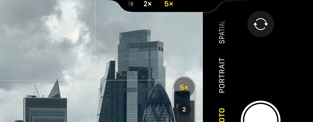
I’m assuming this is just a bug which will be fixed in a later update (I’m on iOS 18.1 beta 4).
But it’s already a huge difference
But even with the limited time I’ve spent using it so far, I’m sold.
Being able to leave my finger on the shutter button and adjust everything from there is a way better experience than having to remove my finger and use the on-screen controls. In particular, it’s much easier to make adjustments without changing the framing of the shot.
This is especially important when adjusting exposure, when any reframing will completely change the setting you need.
I said beforehand that the button would be a far bigger deal than it appeared, and my early experience is very much endorsing that view.
Taking comparison photos may take time
London’s current weather doesn’t make for the most photogenic shots, and the forecast for the rest of the week looks like this:
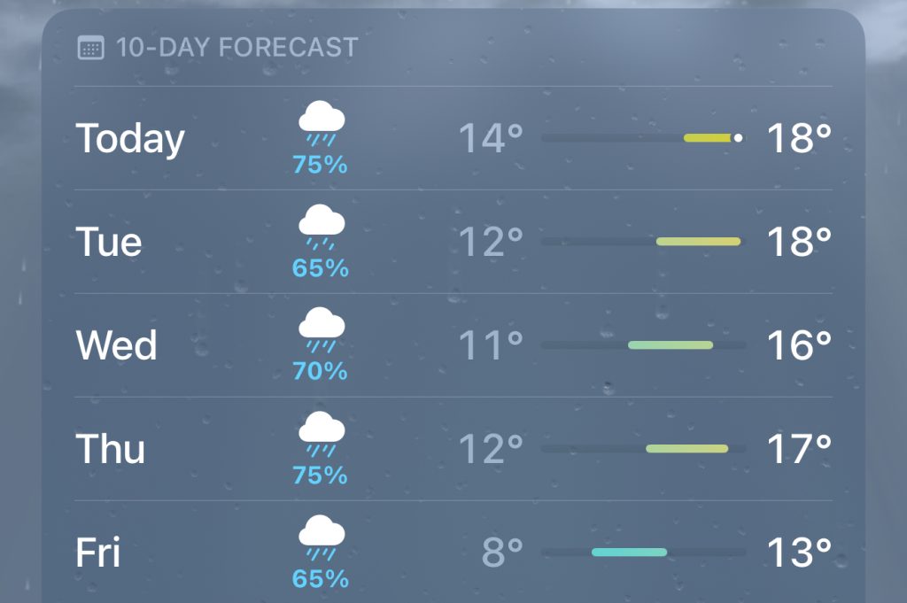
So quite when I’ll get the chance to take some decent camera comparison shots is currently unclear! But the first sign of sun and I’ll head out with a tripod to take the same shots with each phone to see whether the differences are visible.
I’ll also be playing with Photographic Styles. I’m not generally a photo filter guy – I prefer to make my own adjustments manually – but reviewers do seem keen, so I’ll give them a go.
Another thing I’m keen to try is using the slider to zoom during video shots. I don’t make a habit of this, but it is useful in one specific situations: filming dance performances, where the dancers will move from one end of the floor to the other.
More to follow, then, but so far I’d say that the upgrade is all about the Camera Control button for me.
Image: Apple
FTC: We use income earning auto affiliate links. More.