
")
iOS 26 Liquid Glass can be changed if you don’t like Apple’s new look
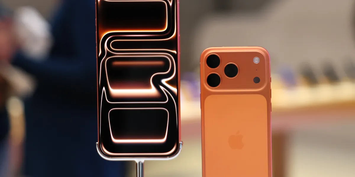
iOS 26 Liquid Glass has quickly become one of the most talked-about changes in Apple’s latest iPhone software update. The new visual style introduces translucent layers, blurred backgrounds, and glass-like interface elements across system menus, notifications, and apps.
While Apple describes Liquid Glass as a modern, immersive design upgrade, not everyone is impressed. Some users find it distracting, others say it reduces readability, and a growing number complain it feels visually overwhelming during everyday use.
The good news is that Apple has quietly included a setting that allows users to reduce or effectively disable much of the Liquid Glass effect on their iPhone.
What iOS 26 Liquid Glass is
The iOS 26 Liquid Glass interface is Apple’s latest visual overhaul, introduced as part of its annual software refresh for the iPhone. The design relies heavily on transparency, layered UI elements, and subtle motion effects that create a glass-like appearance throughout the operating system.
Liquid Glass is most noticeable in areas such as Control Center, notifications, system menus, and background panels. Instead of solid colors, Apple uses blurred versions of the content underneath, aiming to make the interface feel more dynamic and spatial.
According to Apple, the goal is to make iOS feel more fluid and expressive while maintaining consistency across devices.
Why some users dislike iOS 26 Liquid Glass
Despite Apple’s intentions, iOS 26 Liquid Glass has proven divisive. A significant group of users argues that the increased transparency reduces contrast, making text harder to read, especially in bright conditions.
Others say the design prioritises aesthetics over usability. Constant motion, reflections, and blurred layers can feel visually noisy, particularly for users who prefer clean, minimal interfaces.
There are also accessibility concerns. People with visual sensitivity, migraines, or attention-related conditions may find Liquid Glass uncomfortable during prolonged use.
iOS 26 Liquid Glass accessibility setting explained
Apple anticipated some of this feedback. That’s why iOS 26 Liquid Glass can be adjusted using an accessibility feature originally designed to improve readability.
The key setting is Reduce Transparency, which replaces many translucent UI elements with solid backgrounds. While it doesn’t remove every visual effect, it significantly tones down the Liquid Glass aesthetic.
This approach reflects Apple’s long-standing strategy of embedding design flexibility inside accessibility tools rather than offering separate visual themes.
How to change iOS 26 Liquid Glass on your iPhone
To reduce the iOS 26 Liquid Glass effect on your iPhone:
- Open the Settings app
- Tap Accessibility
- Select Display & Text Size
- Turn on Reduce Transparency
Once enabled, the interface immediately becomes more solid and easier to read. Background blur is reduced, menus look flatter, and contrast improves across the system.
For users sensitive to motion, enabling Reduce Motion in the same menu can further simplify the visual experience.
What changes after disabling iOS 26 Liquid Glass
After adjusting the iOS 26 Liquid Glass setting, the iPhone interface feels noticeably calmer. Control Center panels appear darker and more opaque. Notifications stand out more clearly against their backgrounds.
Performance remains unchanged, but some users report the interface feels faster simply because there is less visual distraction.
It’s important to note that Apple does not provide a full “classic mode.” Liquid Glass elements still exist, but their impact is significantly reduced.
Who should adjust iOS 26 Liquid Glass settings
The iOS 26 Liquid Glass adjustment is particularly useful for users who value readability and focus over visual flair. This includes professionals who rely on their iPhone for work, older users, and anyone who prefers a more traditional UI.
It’s also worth enabling for users with accessibility needs. Apple has long positioned iOS as an inclusive platform, and these settings continue that philosophy.
Even users who like Liquid Glass aesthetically may find the reduced version more practical for daily use.
Apple’s design direction and user control
Apple’s software design has steadily moved toward expressive visuals over the past decade. From flat design to depth and now Liquid Glass, each shift reflects changing hardware capabilities and design trends.
The inclusion of controls for iOS 26 Liquid Glass suggests Apple recognises that one visual style does not suit everyone. Rather than rolling back the design, the company offers compromise through accessibility options.
For official guidance, Apple documents these features on its accessibility pages and iOS support resources, which remain dofollow references for further reading.
Final thoughts on iOS 26 Liquid Glass
The iOS 26 Liquid Glass interface represents Apple’s latest attempt to modernise the iPhone experience. While visually striking, it’s not universally loved.
Thankfully, Apple gives users a straightforward way to tone it down. A single setting can dramatically improve readability and comfort without sacrificing performance or functionality.
For users unhappy with Liquid Glass, changing this setting may be the simplest and most effective fix in iOS 26.
