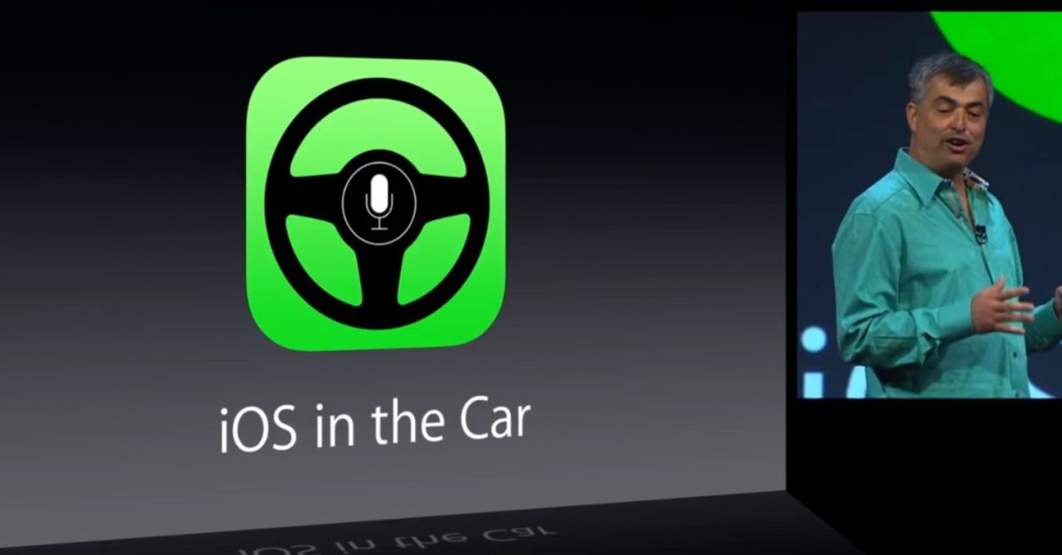
Before CarPlay, Apple previewed ‘iOS in the Car’ with a very different design

Share via:


CarPlay has graduated from a niche upgrade option to a mainstream standard feature in new cars, replacing clunky radio user interfaces with a design very familiar for iPhone users. But before Apple set CarPlay loose in the wild, the world was shown a very different design for Apple’s infotainment feature under a different name.

Sunday marks 10 years since Apple publicly rebranded “iOS in the Car” as CarPlay. Here’s a look back:

Eddy Cue previewed “iOS in the Car” at WWDC 2013 as a new feature in iOS 7 — a software update that changed the way iPhone and iPad software was designed. There were in-depth demos of cars on display that let you try iOS in the Car (that wouldn’t happen for another year), but Cue did share a glimpse of iOS in the Car through a series of slides shown on stage.

“What if you could get iOS on the screen that is built-in to your car,” Eddy Cue pitched 15 minutes before the 2 hour-long keynote ended. “When you make a phone call, it will look something like this,” Cue followed up.

‘Something like this’ was right. Nearly every design decision of the infotainment feature would change before it actually shipped a year later — including its name.
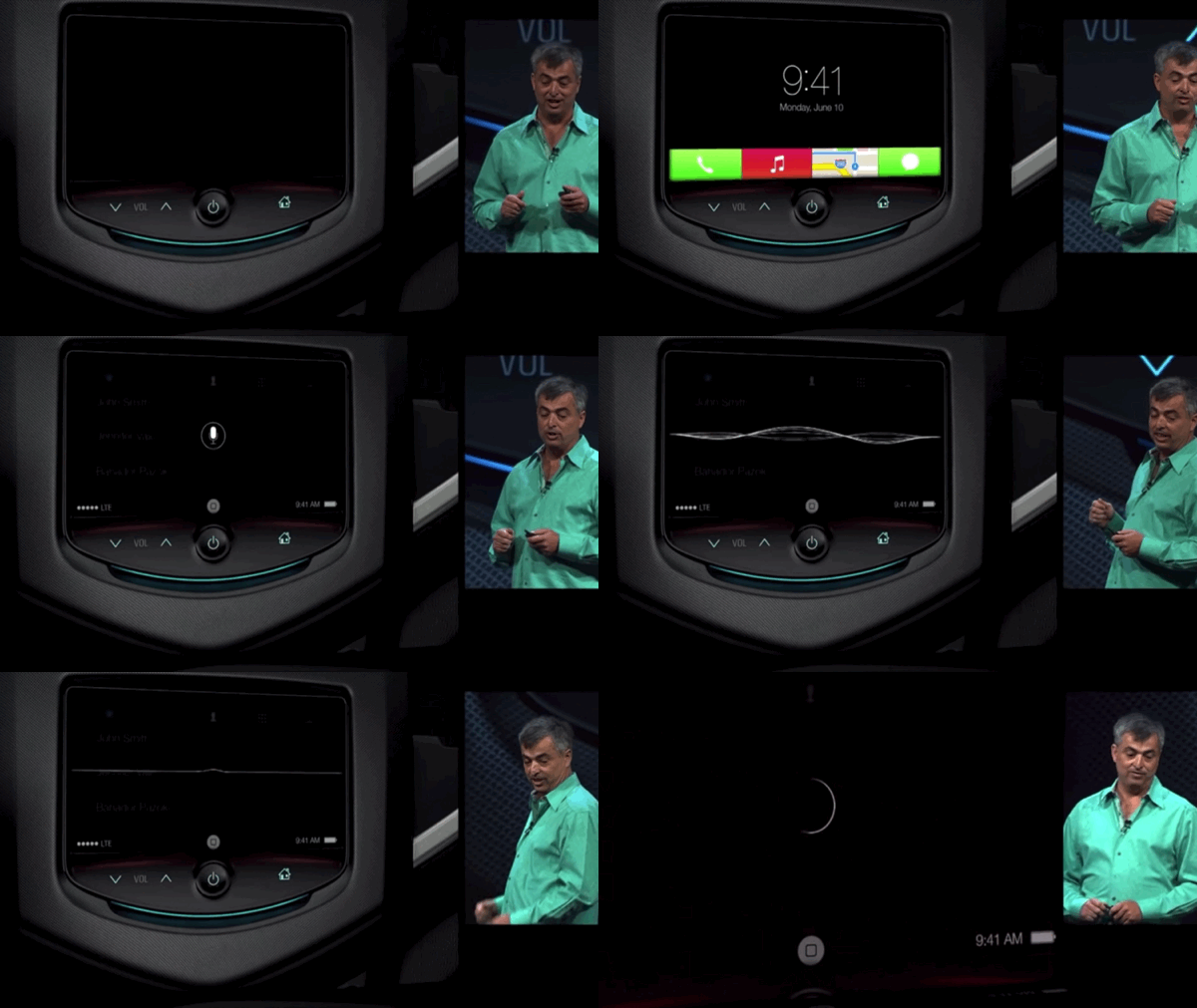
The iPhone lock screen-inspired Home screen with its large clock above the date would be replaced with, well, a grid of app icons for launching apps just like the iPhone. Familiarity defeated the more out-of-the-box concept. We also don’t know how the rethought bottom tile app launcher would have scaled for additional apps.

And the bottom centered virtual Home button would relocate to the more easily accessible bottom corner of the driver’s side (depending on the country). The bottom status bar would also morph into a right- or left-aligned status bar (again, depending on country), only showing the battery status when using the feature over a wireless connection.

The brief iOS in the Car presentation included a few polished animations, but was mostly a slideshow of design concepts for apps that would evolve before they shipped.

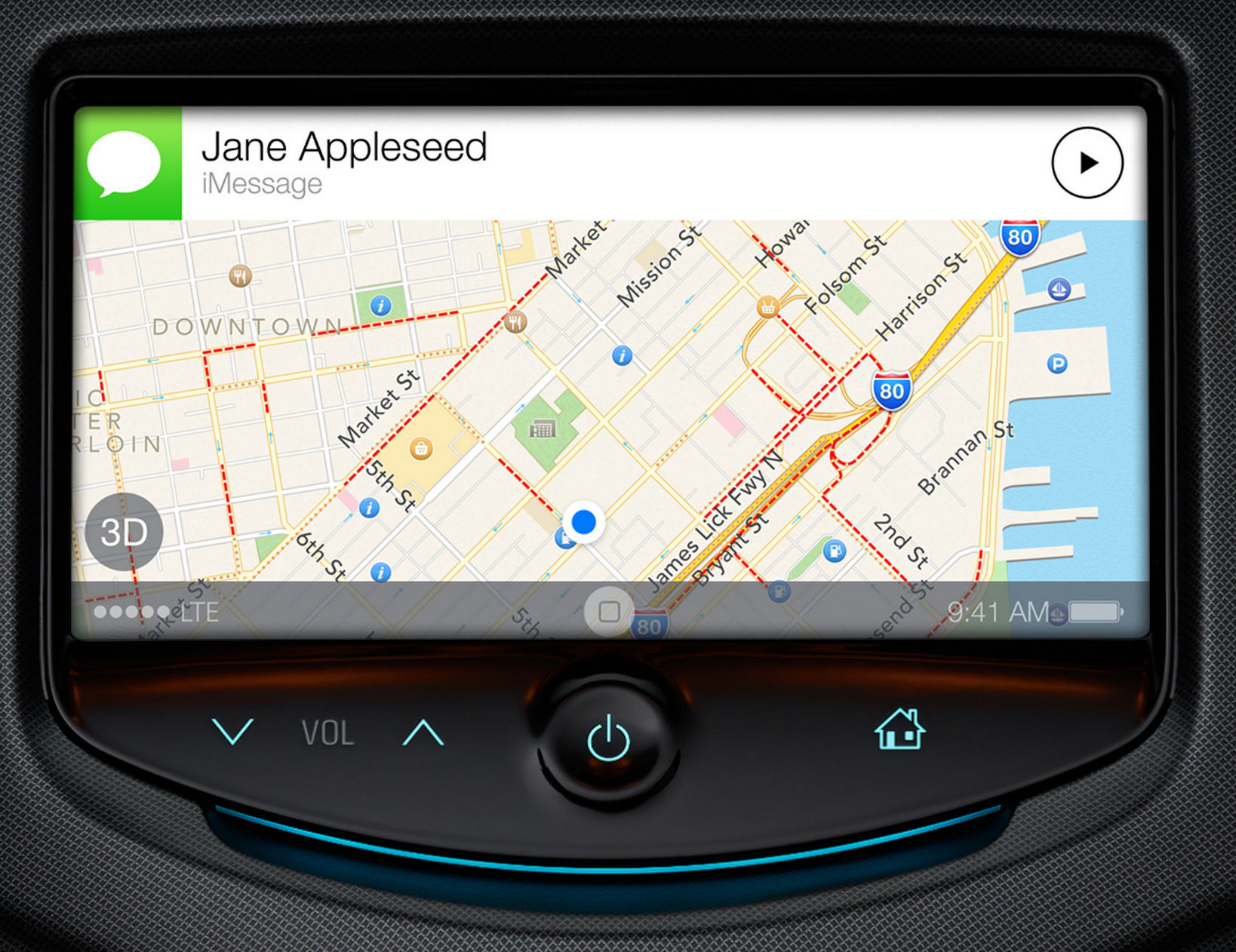
Here’s a comparison of what Apple showed versus what shipped the following year:

Naturally, it was developer Steven Troughton-Smith who first discovered the totally different ‘iOS in the Car’ user interface before it actually shipped. STS uncovered the new Home screen and Maps app in late January 2014, hinting at a larger design overhaul for the feature.

A few weeks later, Apple announced that ‘iOS in the Car’ would be rebranded to the more compact ‘CarPlay’ that we know today — joining the sibling display projection technology AirPlay — with new cars shipping with CarPlay by the end of the car. The roll out was painfully slow to start, but today CarPlay is available in at least some model in some trim from almost every major car brand on the road.

Aftermarket car display makers starting with Pioneer offered CarPlay as an upgrade to the car you already own by the end of 2014. This made CarPlay much more accessible to consumers since there were only a few cars with CarPlay as an option and buying a brand new car is expensive.

Pre-configured CarPlay had benefits like turning off A/C fans when using Siri to improve dictation, but the aftermarket CarPlay experience was enough for us to review the original CarPlay experience in 2014.

CarPlay’s design has seen plenty of changes since it actually shipped. But no design change has been as dramatic as the one between iOS in the Car being announced at WWDC 2013 and CarPlay shipping in iOS 7.1. Maybe not even the vastly expanded next-gen CarPlay coming later this year to select cars.

Related Stories:

FTC: We use income earning auto affiliate links. More.


Source link

Disclaimer

We strive to uphold the highest ethical standards in all of our reporting and coverage. We StartupNews.fyi want to be transparent with our readers about any potential conflicts of interest that may arise in our work. It’s possible that some of the investors we feature may have connections to other businesses, including competitors or companies we write about. However, we want to assure our readers that this will not have any impact on the integrity or impartiality of our reporting. We are committed to delivering accurate, unbiased news and information to our audience, and we will continue to uphold our ethics and principles in all of our work. Thank you for your trust and support.

Popular

More Like this

Before CarPlay, Apple previewed ‘iOS in the Car’ with a very different design


CarPlay has graduated from a niche upgrade option to a mainstream standard feature in new cars, replacing clunky radio user interfaces with a design very familiar for iPhone users. But before Apple set CarPlay loose in the wild, the world was shown a very different design for Apple’s infotainment feature under a different name.

Sunday marks 10 years since Apple publicly rebranded “iOS in the Car” as CarPlay. Here’s a look back:

Eddy Cue previewed “iOS in the Car” at WWDC 2013 as a new feature in iOS 7 — a software update that changed the way iPhone and iPad software was designed. There were in-depth demos of cars on display that let you try iOS in the Car (that wouldn’t happen for another year), but Cue did share a glimpse of iOS in the Car through a series of slides shown on stage.

“What if you could get iOS on the screen that is built-in to your car,” Eddy Cue pitched 15 minutes before the 2 hour-long keynote ended. “When you make a phone call, it will look something like this,” Cue followed up.

‘Something like this’ was right. Nearly every design decision of the infotainment feature would change before it actually shipped a year later — including its name.

The iPhone lock screen-inspired Home screen with its large clock above the date would be replaced with, well, a grid of app icons for launching apps just like the iPhone. Familiarity defeated the more out-of-the-box concept. We also don’t know how the rethought bottom tile app launcher would have scaled for additional apps.

And the bottom centered virtual Home button would relocate to the more easily accessible bottom corner of the driver’s side (depending on the country). The bottom status bar would also morph into a right- or left-aligned status bar (again, depending on country), only showing the battery status when using the feature over a wireless connection.

The brief iOS in the Car presentation included a few polished animations, but was mostly a slideshow of design concepts for apps that would evolve before they shipped.

Here’s a comparison of what Apple showed versus what shipped the following year:

Naturally, it was developer Steven Troughton-Smith who first discovered the totally different ‘iOS in the Car’ user interface before it actually shipped. STS uncovered the new Home screen and Maps app in late January 2014, hinting at a larger design overhaul for the feature.

A few weeks later, Apple announced that ‘iOS in the Car’ would be rebranded to the more compact ‘CarPlay’ that we know today — joining the sibling display projection technology AirPlay — with new cars shipping with CarPlay by the end of the car. The roll out was painfully slow to start, but today CarPlay is available in at least some model in some trim from almost every major car brand on the road.

Aftermarket car display makers starting with Pioneer offered CarPlay as an upgrade to the car you already own by the end of 2014. This made CarPlay much more accessible to consumers since there were only a few cars with CarPlay as an option and buying a brand new car is expensive.
Pre-configured CarPlay had benefits like turning off A/C fans when using Siri to improve dictation, but the aftermarket CarPlay experience was enough for us to review the original CarPlay experience in 2014.

CarPlay’s design has seen plenty of changes since it actually shipped. But no design change has been as dramatic as the one between iOS in the Car being announced at WWDC 2013 and CarPlay shipping in iOS 7.1. Maybe not even the vastly expanded next-gen CarPlay coming later this year to select cars.

Related Stories:

FTC: We use income earning auto affiliate links. More.


Source link

Disclaimer

We strive to uphold the highest ethical standards in all of our reporting and coverage. We StartupNews.fyi want to be transparent with our readers about any potential conflicts of interest that may arise in our work. It’s possible that some of the investors we feature may have connections to other businesses, including competitors or companies we write about. However, we want to assure our readers that this will not have any impact on the integrity or impartiality of our reporting. We are committed to delivering accurate, unbiased news and information to our audience, and we will continue to uphold our ethics and principles in all of our work. Thank you for your trust and support.

Website Upgradation is going on for any glitch kindly connect at office@startupnews.fyi

More like this

The Good Glamm Group Completes Acquisition Of The Moms...

SUMMARY Content-to-commerce unicorn The Good Glamm Group has completed...

HCLTech: HCLSoftware appoints Vikrant Chowdhary as SVP & country...

HCLSoftware, an enterprise software products unit of HCLTech,...

MakeMyTrip to Acquire Happay Expense Management Platform from CRED

MakeMyTrip, India’s leading online travel company, today announced that...

Popular

Upcoming Events

Startup Information that matters. Get in your inbox Daily!