iOS 18 Photos hands-on: Get ready for big changes on your iPhone

Share via:


Years ago, the iPhone was young enough that Apple could make major changes to how iOS works and receive minimal pushback. Today, the iPhone is a mature product with billions of users, so any change in iOS is bound to receive more attention and even criticism.

Change is hard, especially when it affects apps that are used by nearly every iPhone owner.

That’s why the new Photos app in iOS 18 is about to be subject to a whole lot of scrutiny.

Major changes in iOS 18’s Photos app
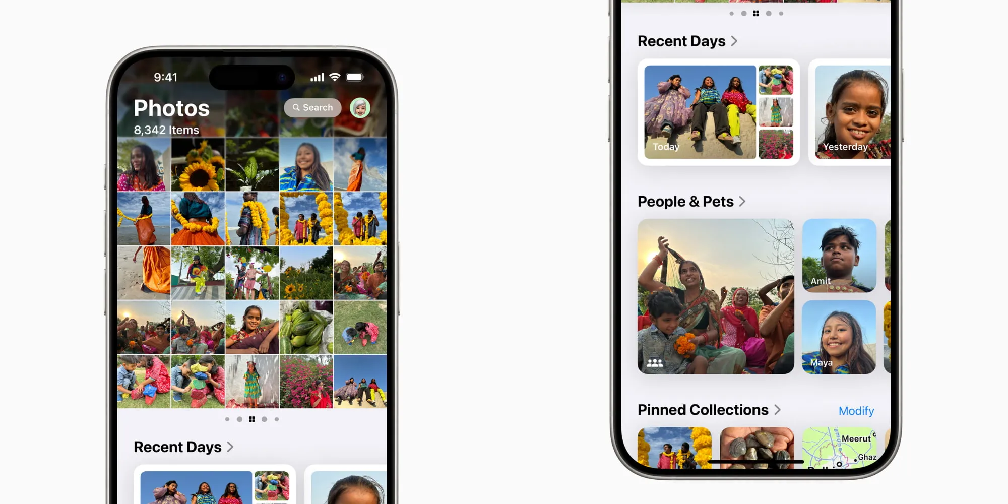
iOS 18’s Photos app

You may have heard that iOS 18 will introduce a new AI image generation tool. That’s true—it’s called Image Playground. That’s not at all what I mean when I say the Photos app is about to be scrutinized.

Apple in iOS 18 has completely redesigned and restructured the basic layout and navigation for the Photos app. In iOS 17 and prior, you would navigate Photos the same way you navigate lots of other apps on your iPhone: with a tab bar at the bottom of the screen. This bar provided buttons to jump between different sections of the app, like Library, For You, Albums, and Search.

That’s all gone in iOS 18. Those four specific buttons are gone, but also the tab bar itself is gone. This tool that has anchored users for years, helping them know where they are in the app and options for quickly jumping elsewhere—completely gone.

So how do you get around the app?

Photos in iOS 18 now puts all your content on a single screen. Similar to the Journal app introduced last year, the entirety of Photos navigation is done in a single screen that you scroll through to find all your content.

That’s it. One screen, scroll up and down, scroll side to side for carousels—everything in the app lives there.

And I must say, it’s been extremely disorienting for me.

Disoriented, but working on adjusting
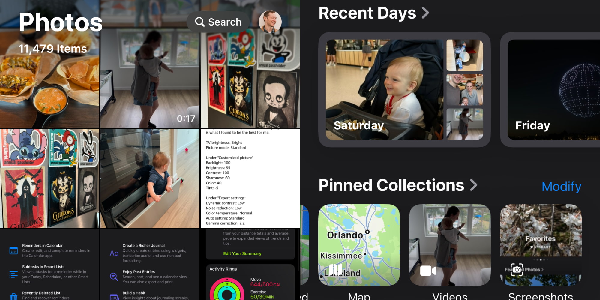
iOS 18’s Photos app

Photos is an app I use every day and that has worked largely the same for as long as I’ve had an iPhone. So yes, even though I’m the kind of person who installs developer betas and writes about Apple for a living, I nonetheless have found adjusting to the new Photos app a challenge.

Which is why I can only imagine how many other users will be shocked and disoriented themselves when they open the new Photos app this fall.

The app is essentially laid out in two main sections: a top carousel, and a bottom area where a variety of highly customizable content collections live. The carousel at the top is where all you’ll access your full Photos library, and it also houses other go-to sections you can swipe through, such as your Favorites album.

I installed the first iOS 18 beta as soon as it became available yesterday, so I’ve been living with the new Photos app less than 24 hours. There’s honestly a lot to love about it, and I’m starting to get used to the changes, but only after making some tweaks—which the app lets you do, but most users probably won’t ever know that.

Customizing your Photos experience
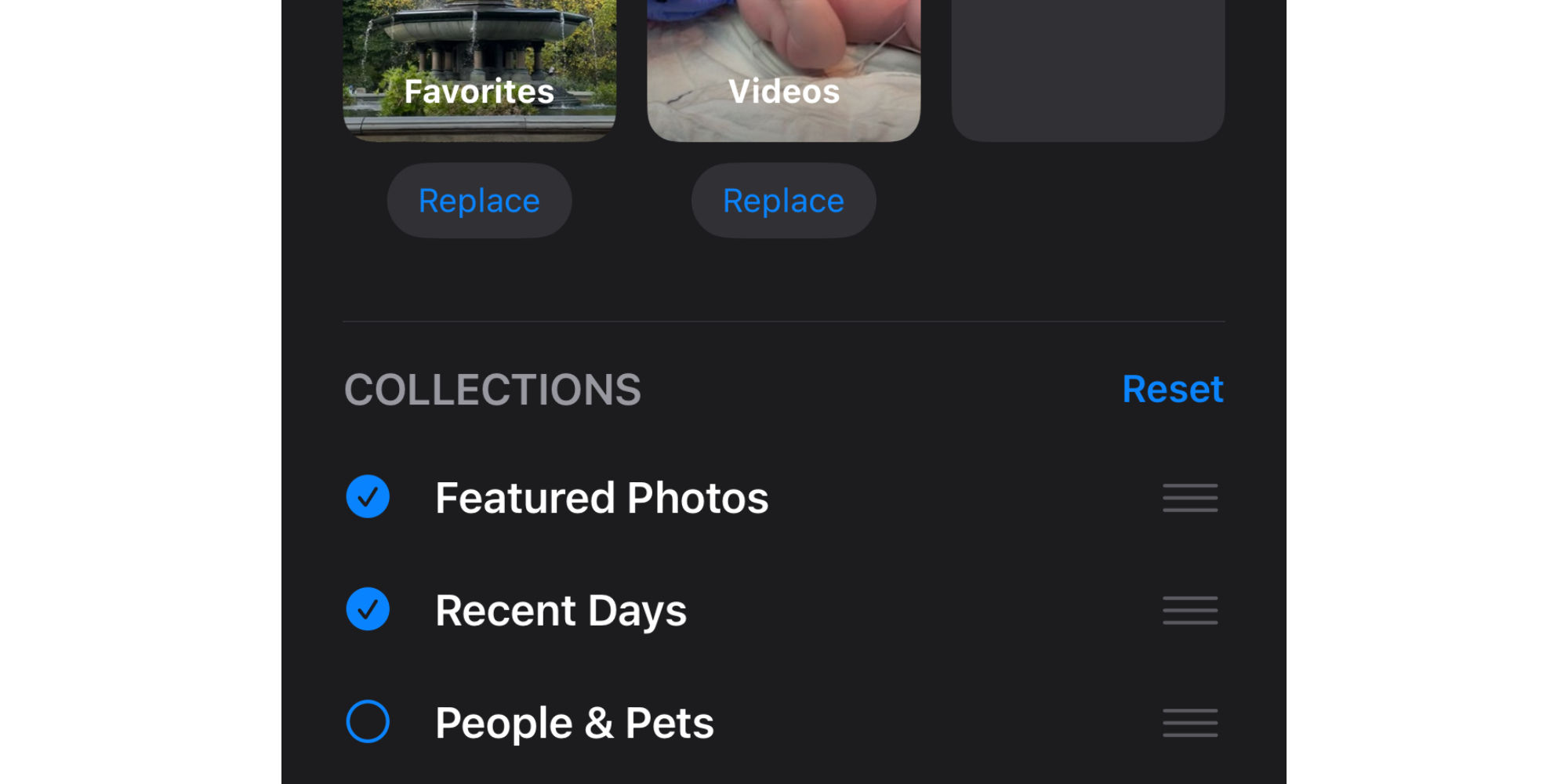
Customizing iOS 18’s Photos app

One feature I’m very thankful exists in iOS 18’s Photos is the ability to customize exactly which collections of content live inside that bottom portion of the app’s single-screen UI, and in what order those collections are presented.

Photos sets up an array of collections by default, but if you scroll to the bottom of the app, you’ll find a Customize button. From here you can enable or disable, and reorder, all of the following collections:

  • Recent Days
  • People & Pets
  • Pinned Collections
  • Memories
  • Trips
  • Featured Photos
  • Albums
  • Shared Albums
  • Media Types
  • Utilities
  • Wallpaper Suggestions

Another important customization tool for me has to do with the main grid of photos, which lives at the top of the app. Historically I’ve used my Recents album far more than the All Photos view inside Library.

iOS 18 merges these two into a single photo library at the top of the app, but if you pull down on it, you can adjust the view to sort by recently added rather than the default ‘Date Captured’ option. You can also filter what types of photos and videos display here, and update the view settings.

Wrap-up

iOS 18 brings a bold new direction for the Photos app. I’m just afraid most users are going to have a hard time adjusting to it.

What’s been a huge help to me is customizing the app to my liking, adjusting several different settings to make it more like the Photos app I know and love from iOS 17 and previously. But most users probably won’t discover those customization settings.

I’m all for Apple trying new designs, but I’m concerned Photos will be too much change, too fast for many.

Have you tried the new Photos app in iOS 18? What do you think? Let us know in the comments.

FTC: We use income earning auto affiliate links. More.


Source link

Disclaimer

We strive to uphold the highest ethical standards in all of our reporting and coverage. We StartupNews.fyi want to be transparent with our readers about any potential conflicts of interest that may arise in our work. It’s possible that some of the investors we feature may have connections to other businesses, including competitors or companies we write about. However, we want to assure our readers that this will not have any impact on the integrity or impartiality of our reporting. We are committed to delivering accurate, unbiased news and information to our audience, and we will continue to uphold our ethics and principles in all of our work. Thank you for your trust and support.

Popular

More Like this

iOS 18 Photos hands-on: Get ready for big changes on your iPhone


Years ago, the iPhone was young enough that Apple could make major changes to how iOS works and receive minimal pushback. Today, the iPhone is a mature product with billions of users, so any change in iOS is bound to receive more attention and even criticism.

Change is hard, especially when it affects apps that are used by nearly every iPhone owner.

That’s why the new Photos app in iOS 18 is about to be subject to a whole lot of scrutiny.

Major changes in iOS 18’s Photos app

iOS 18’s Photos app

You may have heard that iOS 18 will introduce a new AI image generation tool. That’s true—it’s called Image Playground. That’s not at all what I mean when I say the Photos app is about to be scrutinized.

Apple in iOS 18 has completely redesigned and restructured the basic layout and navigation for the Photos app. In iOS 17 and prior, you would navigate Photos the same way you navigate lots of other apps on your iPhone: with a tab bar at the bottom of the screen. This bar provided buttons to jump between different sections of the app, like Library, For You, Albums, and Search.

That’s all gone in iOS 18. Those four specific buttons are gone, but also the tab bar itself is gone. This tool that has anchored users for years, helping them know where they are in the app and options for quickly jumping elsewhere—completely gone.

So how do you get around the app?

Photos in iOS 18 now puts all your content on a single screen. Similar to the Journal app introduced last year, the entirety of Photos navigation is done in a single screen that you scroll through to find all your content.

That’s it. One screen, scroll up and down, scroll side to side for carousels—everything in the app lives there.

And I must say, it’s been extremely disorienting for me.

Disoriented, but working on adjusting

iOS 18’s Photos app

Photos is an app I use every day and that has worked largely the same for as long as I’ve had an iPhone. So yes, even though I’m the kind of person who installs developer betas and writes about Apple for a living, I nonetheless have found adjusting to the new Photos app a challenge.

Which is why I can only imagine how many other users will be shocked and disoriented themselves when they open the new Photos app this fall.

The app is essentially laid out in two main sections: a top carousel, and a bottom area where a variety of highly customizable content collections live. The carousel at the top is where all you’ll access your full Photos library, and it also houses other go-to sections you can swipe through, such as your Favorites album.

I installed the first iOS 18 beta as soon as it became available yesterday, so I’ve been living with the new Photos app less than 24 hours. There’s honestly a lot to love about it, and I’m starting to get used to the changes, but only after making some tweaks—which the app lets you do, but most users probably won’t ever know that.

Customizing your Photos experience

Customizing iOS 18’s Photos app

One feature I’m very thankful exists in iOS 18’s Photos is the ability to customize exactly which collections of content live inside that bottom portion of the app’s single-screen UI, and in what order those collections are presented.

Photos sets up an array of collections by default, but if you scroll to the bottom of the app, you’ll find a Customize button. From here you can enable or disable, and reorder, all of the following collections:

  • Recent Days
  • People & Pets
  • Pinned Collections
  • Memories
  • Trips
  • Featured Photos
  • Albums
  • Shared Albums
  • Media Types
  • Utilities
  • Wallpaper Suggestions

Another important customization tool for me has to do with the main grid of photos, which lives at the top of the app. Historically I’ve used my Recents album far more than the All Photos view inside Library.

iOS 18 merges these two into a single photo library at the top of the app, but if you pull down on it, you can adjust the view to sort by recently added rather than the default ‘Date Captured’ option. You can also filter what types of photos and videos display here, and update the view settings.

Wrap-up

iOS 18 brings a bold new direction for the Photos app. I’m just afraid most users are going to have a hard time adjusting to it.

What’s been a huge help to me is customizing the app to my liking, adjusting several different settings to make it more like the Photos app I know and love from iOS 17 and previously. But most users probably won’t discover those customization settings.

I’m all for Apple trying new designs, but I’m concerned Photos will be too much change, too fast for many.

Have you tried the new Photos app in iOS 18? What do you think? Let us know in the comments.

FTC: We use income earning auto affiliate links. More.


Source link

Disclaimer

We strive to uphold the highest ethical standards in all of our reporting and coverage. We StartupNews.fyi want to be transparent with our readers about any potential conflicts of interest that may arise in our work. It’s possible that some of the investors we feature may have connections to other businesses, including competitors or companies we write about. However, we want to assure our readers that this will not have any impact on the integrity or impartiality of our reporting. We are committed to delivering accurate, unbiased news and information to our audience, and we will continue to uphold our ethics and principles in all of our work. Thank you for your trust and support.

Website Upgradation is going on for any glitch kindly connect at office@startupnews.fyi

More like this

CFTC report endorses tokenizing trading collateral 

Distributed ledger technology can help solve longstanding challenges...

Elon Musk is directing harassment toward individual federal workers

Elon Musk is, in addition to many other...

CFTC report endorses tokenizing trading collateral 

Distributed ledger technology can help solve longstanding challenges...

Popular

Upcoming Events

Startup Information that matters. Get in your inbox Daily!