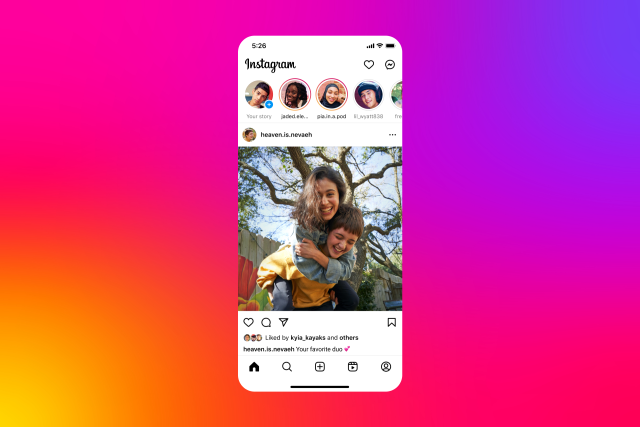
Instagram’s redesigned home screen ditches the shopping tab

Share via:

Instagram has revealed a February home screen refresh that will remove the Shop tab and relocate the Create button to the centre of the bottom navigation bar. As a result, the Reels tab is pushed to the side.

Shopping will still be available in your feed, Reels, Stories, and ads, according to Adam Mosseri of the social network. There will simply be no dedicated tab for it. The section typically provides targeted recommendations to encourage shopping outside of the typical mid-feed offerings. In September, Instagram began testing the new design. Mosseri described the refresh in a video announcing the rollout as an effort to “simplify” the service and focus on connecting people to “things they love.” To put it bluntly, Instagram is remembering that it is a social network.

Disclaimer

We strive to uphold the highest ethical standards in all of our reporting and coverage. We StartupNews.fyi want to be transparent with our readers about any potential conflicts of interest that may arise in our work. It’s possible that some of the investors we feature may have connections to other businesses, including competitors or companies we write about. However, we want to assure our readers that this will not have any impact on the integrity or impartiality of our reporting. We are committed to delivering accurate, unbiased news and information to our audience, and we will continue to uphold our ethics and principles in all of our work. Thank you for your trust and support.

Popular

More Like this

Instagram’s redesigned home screen ditches the shopping tab

Instagram has revealed a February home screen refresh that will remove the Shop tab and relocate the Create button to the centre of the bottom navigation bar. As a result, the Reels tab is pushed to the side.

Shopping will still be available in your feed, Reels, Stories, and ads, according to Adam Mosseri of the social network. There will simply be no dedicated tab for it. The section typically provides targeted recommendations to encourage shopping outside of the typical mid-feed offerings. In September, Instagram began testing the new design. Mosseri described the refresh in a video announcing the rollout as an effort to “simplify” the service and focus on connecting people to “things they love.” To put it bluntly, Instagram is remembering that it is a social network.

Disclaimer

We strive to uphold the highest ethical standards in all of our reporting and coverage. We StartupNews.fyi want to be transparent with our readers about any potential conflicts of interest that may arise in our work. It’s possible that some of the investors we feature may have connections to other businesses, including competitors or companies we write about. However, we want to assure our readers that this will not have any impact on the integrity or impartiality of our reporting. We are committed to delivering accurate, unbiased news and information to our audience, and we will continue to uphold our ethics and principles in all of our work. Thank you for your trust and support.

Website Upgradation is going on for any glitch kindly connect at office@startupnews.fyi

More like this

Tessl raises $125M at $500M+ valuation to build AI...

Many startups and larger tech companies have taken...

Losses Decline 45% YoY To INR 370 Cr

SUMMARY The ride-hailing major attributed the reduced FY24 losses...

Zoomcar Cuts Q2 Loss To $3.35 Mn, Revenue Dips...

SUMMARY On a quarter-on-quarter basis, Zoomcar's consolidated net loss...

Popular

Upcoming Events

Startup Information that matters. Get in your inbox Daily!